How to Understand the CSS Box Model With Real Examples
 remove_red_eye
41 Views
remove_red_eye
41 Views
The CSS Box Model is the absolute foundation of web design and layout. Every single element you place on a webpage whether it is a heading, a paragraph, an image, or a navigation bar is treated by the browser as a rectangular box. Even if you use CSS to make an element look like a circle using border-radius, the browser still calculates its position and spacing based on a rectangular box. Understanding how these boxes are constructed is essential for any web developer.
If you do not master the box model, you will constantly struggle with elements that do not sit where you want them to, layouts that break on different screen sizes, and mysterious gaps that appear between your components. The box model is essentially the set of rules that governs how much space an element occupies and how it interacts with its neighbors. It is the invisible skeleton of the web. Without it, the browser would have no way of knowing how to stack text next to images or how to create the margins that make a page readable. Every professional website you visit relies on the precise manipulation of these boxes to create a clean, organized, and user-friendly experience.
Lesson overview
In this lesson, you will dive deep into the four distinct layers that make up every HTML element: Content, Padding, Border, and Margin. You will learn the specific purpose of each layer and how they stack on top of one another. We will explore the mathematical calculation behind the total width and height of an element, which is a common source of bugs for beginners. Finally, you will learn about the box-sizing property, which is a modern CSS tool used to simplify these calculations and prevent layout headaches. We will also discuss the visual representation of these boxes in browser developer tools so you can debug your own projects like a professional.
Key concepts
The key concepts we will cover are the Content area (the heart of the element), Padding (the internal breathing room), Border (the visible or invisible frame), and Margin (the external spacing). We will also discuss the two main box-sizing modes: content-box and border-box. Understanding the difference between these two is the “lightbulb moment” for most new developers. We will also touch on how background colors and images interact with these different layers.
Expected outcome
By the end of this post, you will be able to visualize the invisible boxes surrounding your HTML elements. You will have a practical understanding of how to use spacing to create clean, professional-looking designs. Most importantly, you will be able to calculate the footprint of any element on your page with 100% accuracy, ensuring your layouts remain stable and predictable. You will no longer be “guessing” when you add padding or margins; you will be designing with intent and precision.
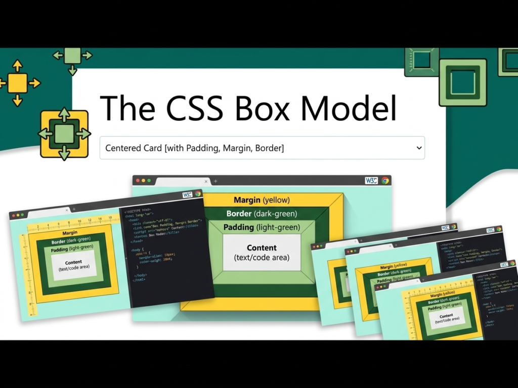
To truly grasp the CSS Box Model, it helps to imagine a physical object, like a framed photograph hanging on a wall in a gallery.
- The Content Area: The content is the innermost part of the box. It is the actual stuff you are putting on the page, such as a block of text, a digital photo, or a video player. In CSS, the dimensions of this area are controlled by the width and height properties. If you have a paragraph of text, the content area is exactly where the letters sit. If the content is too large for the box, you might see it overflow, which is another CSS topic entirely, but for now, just think of this as the core of the element.
- The Padding: Padding is the space between the content and the border. Think of it as the white matting inside a picture frame that surrounds the photo. Padding is part of the element’s internal space. If you give a box a background color, that color will extend behind the padding. Padding is used to give your content room to breathe so that text doesn’t touch the edges of its container. Without padding, your website would look like a giant wall of cramped text.
- The Border: The border wraps around both the content and the padding. In our analogy, this is the physical wooden or metal frame. Borders can be thin, thick, or even invisible. You can style them with colors and different line types like solid, dashed, or dotted. The border marks the edge of the element’s visual footprint. It is the boundary where the internal space of the element ends and the external world begins.
- The Margin: The margin is the outermost layer. It is the empty space outside the border that separates the element from other elements on the page. In the picture frame analogy, the margin is the empty wall space between one frame and the next frame hanging on the wall. Margins are always transparent and do not show the background color of the element. They are used exclusively for positioning and creating distance between components.
The Math of the Box Model
By default, browsers use a calculation method called content-box. This means that when you set a width of 300px, you are only setting the width of the content area. If you add 20px of padding and a 5px border, your box actually becomes 350px wide (300 + 20 left + 20 right + 5 left + 5 right).
The Modern Solution: Border-Box
To fix this, we use the property box-sizing: border-box. When this is applied, the width you set includes the padding and the border. If you set a width of 300px with border-box, the box stays 300px wide, and the padding and border simply push inward. This is the industry standard for modern web development because it makes building grids and responsive layouts much more intuitive.
HTML Markup:
<div class=”outer-wrapper”>
<div class=”box-one”>
This is Content Box (Standard)
</div>
<div class=”box-two”>
This is Border Box (Modern)
</div>
</div>
CSS Styles:
.outer-wrapper {
background-color: #f0f0f0;
padding: 50px;
}
.box-one {
width: 300px;
height: 100px;
background-color: #e74c3c;
color: white;
padding: 30px;
border: 10px solid #c0392b;
margin-bottom: 20px;
box-sizing: content-box;
}
.box-two {
width: 300px;
height: 100px;
background-color: #2ecc71;
color: white;
padding: 30px;
border: 10px solid #27ae60;
box-sizing: border-box;
}
In the code above, box-one and box-two both have a width of 300px in the CSS. However, when you view them in a browser, box-one will look much larger than box-two. This is because box-one is adding the padding and border to the 300px, making its total width 380px. Box-two is including them within the 300px, so it stays at exactly 300px. This comparison is the best way to see the box model in action.
When designing a professional site, many developers apply a global reset to ensure every element behaves predictably. This is usually done by applying border-box to all elements and their pseudo-elements. This prevents the “growing box” problem where an element unexpectedly breaks a layout because you decided to add a few pixels of padding.
Additionally, pay close attention to margin collapsing. This is a CSS behavior where vertical margins between adjacent elements combine into one. For example, if you have two boxes where the top one has a bottom margin of 30px and the bottom one has a top margin of 20px, the total gap between them is 30px, not 50px. The browser chooses the larger of the two margins.
Playground
See the Pen CodePen Demo
Assignment
Task 1
Copy the HTML and CSS above into a file named index.html. Open it in your browser and use the Inspect tool (Right-click > Inspect). Click on each box and look at the Layout tab to see the box model diagram. Note the difference in the total calculated width.
Task 2
Create a third box. Give it a width of 50%, a padding of 20px, and a border of 5px. Try to place two of these boxes side-by-side. First, do this with box-sizing: content-box and see if they fit. Then, change it to border-box and observe how the layout corrects itself.
Skill Check
Advertisement