Build a Sliding Side Menu with HTML, CSS, and JavaScript
 remove_red_eye
55 Views
remove_red_eye
55 Views
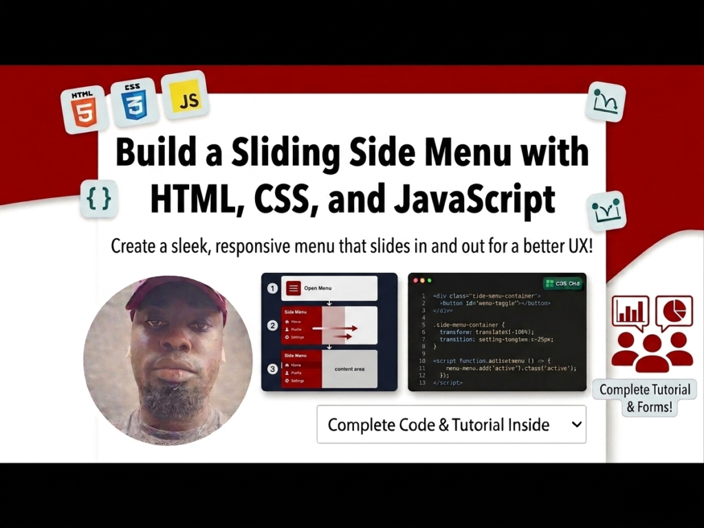
A clean, accessible navigation system is the backbone of a great user experience. A sliding side menu allows you to keep your primary content front and center while tucking away navigation links until they are needed. In this tutorial, we will create a “hamburger” style menu that toggles smoothly using CSS transitions and a tiny bit of JavaScript.
Lesson Overview
- What you will learn: How to hide elements off-screen and toggle them using CSS classes.
- Key concepts: CSS transition, absolute vs. fixed positioning, and the classList.toggle method.
- Expected outcome: A functional, animated sidebar that slides in from the left side of the screen.
The secret to a sliding menu is placing it at a negative coordinate (off-screen) and then moving it back to 0 when a specific class is applied.
Step 1: The HTML Structure
We need a container for the sidebar, a list for the navigation items, and a “toggle button” made of three spans to create the classic hamburger icon.
<div id=”sidebar”>
<div class=”toggle-btn” onclick=”toggleSidebar()”>
<span></span>
<span></span>
<span></span>
</div>
<ul>
<li>Home</li>
<li>About</li>
<li>Contact</li>
</ul>
</div>
Step 2: Styling the Off-Canvas Menu
We use position: fixed to ensure the menu covers the full height of the screen. By setting left: -200px, we hide the 200px-wide sidebar just out of view.
#sidebar {
position: fixed;
width: 200px;
height: 100%;
background-color: #151719;
left: -200px; /* Hides the menu */
transition: all 400ms linear; /* Animates the slide */
}
/* This class will be added via JavaScript */
#sidebar.active {
left: 0px;
}
ul li {
color: rgba(230, 230, 230, 0.9);
list-style: none;
padding: 15px 10px;
border-bottom: 1px solid rgba(100, 100, 100, 0.3);
cursor: pointer;
}
Step 3: Creating the Toggle Button
The button needs to stay visible even when the menu is hidden. We position it absolutely to the right of the sidebar’s edge.
#sidebar .toggle-btn {
position: absolute;
left: 230px; /* Positions button outside the sidebar container */
top: 20px;
}
#sidebar .toggle-btn span {
display: block;
width: 30px;
height: 5px;
background: #151719;
margin: 5px 0px;
cursor: pointer;
}
Step 4: The JavaScript Logic
To make the menu move, we simply need to “toggle” the .active class on our sidebar element whenever the button is clicked.
function toggleSidebar() {
document.getElementById(‘sidebar’).classList.toggle(‘active’);
}
Playground
See the Pen CodePen Demo
Assignment
Task 1
Modify the CSS so that the sidebar slides in from the right side of the screen instead of the left. (Hint: Use the right property instead of left).
Task 2
Update the JavaScript to change the background color of the toggle-btn spans to a bright color (like red) only when the sidebar is in its “active” state.
Skill Check
- What is the difference between position: fixed and position: absolute in CSS?
- How does the transition property create smooth animations between CSS states?
- What are the advantages of using classList.toggle() over manually adding and removing classes?
Advertisement