CSS Positioning Solved: How to Use Absolute, Relative, Fixed, and Sticky
 remove_red_eye
97 Views
remove_red_eye
97 Views
CSS positioning is the toolset that allows you to move elements out of the normal document flow and place them exactly where you want them on the screen. By default, HTML elements follow a static flow, stacking one after another. However, modern web design requires more flexibility like headers that stay at the top while you scroll, or icons that sit perfectly in the corner of a card. Understanding the nuances between relative, absolute, fixed, and sticky positioning is essential for creating complex, layered, and interactive user interfaces. Without mastering these properties, your layouts will remain rigid and limited to simple vertical stacks. Proper positioning is what separates a basic text document from a fully functional, modern web application.
Lesson overview
In this lesson, you will learn the five values of the CSS position property: static, relative, absolute, fixed, and sticky. We will explore how each value changes the element’s relationship with its parent container and the browser viewport. You will also learn about offset properties like top, right, bottom, and left and how the z-index property allows you to stack elements on top of each other. Finally, we will discuss the practical use cases for each positioning type in real-world web development scenarios, such as navigation bars and floating buttons.
Key concepts
The key concepts include the Normal Document Flow, which is the default way elements occupy space. We will cover Positioned Elements, which are any elements with a position value other than static. We will also dive deep into the Containing Block concept, which determines what an absolute element is actually relative to. Additionally, we will discuss how fixed and sticky positioning interact with user scrolling behavior and the viewport, as well as the importance of stacking contexts created by the z-index property.
Expected outcome
By the end of this post, you will be able to confidently choose the right positioning method for any design challenge. You will know how to create sticky navigation bars, centered modal pop-ups, and decorative elements that overlap without breaking your layout. You will also understand how to troubleshoot common positioning bugs, such as elements disappearing because they have been moved relative to the wrong parent container or being hidden behind other layers.
To master positioning, you must first understand that every element starts as position: static. This means it follows the natural order of the HTML.
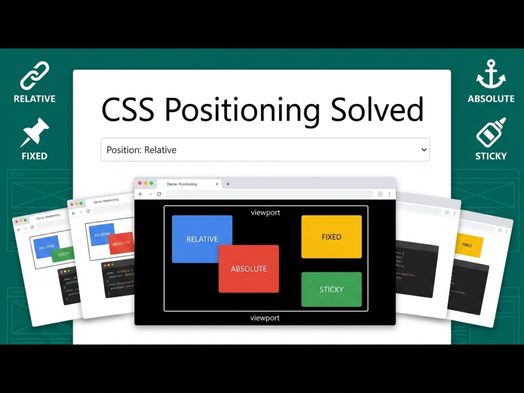
- Relative Positioning
When you set an element to position: relative, it remains in the normal flow of the document, but you gain the ability to move it using top, right, bottom, or left. The most important thing to remember is that the space the element originally occupied is reserved. Even if you move a relative box 50px to the right, the surrounding elements won’t move to fill the gap. It is also frequently used as a reference point for absolute children. - Absolute Positioning
This is a very powerful positioning type. An absolute element is removed from the normal document flow. It no longer takes up any space in the layout. Instead, it is positioned relative to its closest positioned ancestor (an ancestor that is relative, absolute, fixed, or sticky). If no such ancestor exists, it defaults to the body of the page. This allows you to pin an icon to the top-right corner of a specific box regardless of other content. - Fixed Positioning
Fixed elements are also removed from the flow, but they are positioned relative to the browser viewport. No matter how far the user scrolls, a fixed element stays in the exact same spot on the screen. This is the standard way to create persistent Back to Top buttons or sidebars that remain visible as the user reads a long article. - Sticky Positioning
Sticky is a hybrid of relative and fixed. An element acts like relative positioning until the user scrolls to a specific point, at which point it sticks to the screen and acts like a fixed element. However, it is confined to the boundaries of its parent container. Once the parent container scrolls out of view, the sticky element goes with it. This is perfect for table headers or category headings in a long list.
HTML Markup:
<div class=”page-wrapper”>
<nav class=”sticky-nav”>I am a Sticky Header</nav>
<div class=”relative-parent”>
I am a Relative Parent.
<div class=”absolute-child”>I am Absolute</div>
</div>
<div class=”fixed-box”>Fixed</div>
<div class=”spacer”>Scroll down to see the effects…</div>
</div>
CSS Styles:
.page-wrapper {
font-family: sans-serif;
height: 2000px;
padding: 20px;
}
.sticky-nav {
position: -webkit-sticky;
position: sticky;
top: 0;
background-color: #2ecc71;
color: white;
padding: 15px;
text-align: center;
z-index: 100;
}
.relative-parent {
position: relative;
width: 300px;
height: 200px;
background-color: #f1c40f;
margin-top: 50px;
padding: 20px;
border: 2px solid #d4ac0d;
}
.absolute-child {
position: absolute;
top: 10px;
right: 10px;
width: 80px;
height: 80px;
background-color: #e74c3c;
color: white;
display: flex;
align-items: center;
justify-content: center;
font-size: 12px;
}
.fixed-box {
position: fixed;
bottom: 20px;
right: 20px;
width: 60px;
height: 60px;
background-color: #3498db;
color: white;
border-radius: 50%;
display: flex;
align-items: center;
justify-content: center;
box-shadow: 0 4px 8px rgba(0,0,0,0.2);
}
.spacer {
margin-top: 100px;
color: #7f8c8d;
}
In this example, the sticky-nav will stay at the top of the browser window as you scroll down, but only within the limits of its container. The relative-parent provides a reference coordinate system for the absolute-child. Notice that the red absolute box is pinned 10px from the top and right of the yellow box, not the entire page. The fixed-box will stay in the bottom-right corner of your screen regardless of where you are on the page.
One critical concept to master is the z-index property. When elements overlap due to positioning, z-index determines which one sits on top. A higher z-index value moves the element closer to the viewer. This only works on elements that have a position value other than static. If you ever find an element hidden behind another, check its position value and its z-index relative to its neighbors.
Another common mistake is forgetting that absolute positioning takes the element out of the flow. If you make a parent container’s only child absolute, the parent will collapse to a height of 0px because it thinks it is empty. You must ensure the parent has a defined height or other static content to maintain its shape. Mastering these small details will make your CSS much more robust and professional as you build out your educational content.
Playground
See the Pen CodePen Demo
Assignment
Task 1
Create an HTML page with a long paragraph of text. Create a Top button using fixed positioning that stays in the bottom-right corner. Ensure it remains usable as the user scrolls. Use a high z-index to make sure it stays above the text and remains clickable throughout the user’s journey.
Task 2
Build a Card component with an image and a Sale badge. Use relative positioning for the card and absolute positioning for the badge so that the badge sits perfectly over the top-left corner of the image. Experiment with negative values for the top and left properties to make it pop.