How to create sticky headers and footers that work on all screens
 remove_red_eye
4 Views
remove_red_eye
4 Views
Creating sticky headers and footers that remain consistently positioned across mobile, tablet, and desktop screens is a fundamental task in modern web design.
This guide uses semantic HTML5, CSS Flexbox, and modern viewport units to build a highly responsive, bulletproof sticky layout.
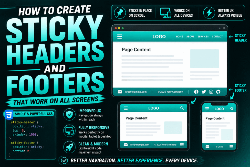
The Semantic HTML Structure
To keep layout management clean, we wrap our main content areas in semantic tags. This structure separates the layout into three distinct zones: the header, the main body, and the footer.
<header class="site-header">
<h1>Sticky Header</h1>
</header>

Scroll down to see the sticky behavior in action…
<div class="spacer"></div>
This content simulates a long page.

<footer class="site-footer">Sticky Footer Content</footer>
The Responsive CSS Layout
The secret to preventing mobile browser address bars from breaking your layout is using the Dynamic Viewport Height (dvh) unit alongside CSS Flexbox. This ensures the header and footer stay pinned perfectly to the visible screen edges.
/* Reset default browser margins and paddings */
* {
box-sizing: border-box;
margin: 0;
padding: 0;
}
/* Establish the viewport container */
body {
display: flex;
flex-direction: column;
min-height: 100dvh; /* Fallback for older browsers: use min-height: 100vh; */
font-family: system-ui, sans-serif;
background-color: #f4f4f7;
color: #333;
}
/* Sticky Header styling */
.site-header {
position: sticky;
top: 0;
z-index: 1000;
background-color: #1e1e24;
color: #ffffff;
padding: 1rem 2rem;
box-shadow: 0 2px 10px rgba(0, 0, 0, 0.1);
}
/* Main content fills available space */
.site-content {
flex: 1 0 auto;
padding: 2rem;
}
/* Simulates content depth for scrolling demonstration */
.spacer {
height: 120vh;
}
/* Sticky Footer styling */
.site-footer {
position: sticky;
bottom: 0;
z-index: 1000;
background-color: #1e1e24;
color: #ffffff;
padding: 1rem 2rem;
box-shadow: 0 -2px 10px rgba(0, 0, 0, 0.1);
}
Playground
See the Pen CodePen Demo
How the Code Works
min-height: 100dvh: The Dynamic Viewport Height unit automatically recalculates when mobile browser toolbars collapse or expand, preventing layout shifts.
flex-direction: column: This stacks the elements vertically. The flex: 1 0 auto on the main content ensures it expands to fill any remaining empty screen space, preventing the footer from riding up on short pages.
position: sticky: Unlike position: fixed, sticky elements stay within the normal document flow until they reach their specified scroll boundary (top: 0 or bottom: 0), rendering seamlessly on all devices without overlapping body text.
z-index: 1000: This ensures that headers and footers always float above standard page elements during scrolling.