How to build responsive layouts using flexbox step by step
 remove_red_eye
6 Views
remove_red_eye
6 Views
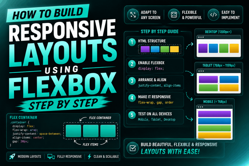
Understanding the Flexbox Architecture
Flexbox (Flexible Box Layout) is a one dimensional layout model. It excels at distributing space and aligning items along a single axis (either horizontally as a row or vertically as a column).
To build a flexbox layout, you need a parent element designated as the flex container, and direct children acting as flex items.
Step 1: Establish the HTML Structure
Start with a semantic HTML wrapper. We will create a simple grid layout featuring a container and three responsive card items.
<div class="layout-container">
<div class="layout-card">
<h3>Strategy</h3>
Planning the architecture of your digital application.
</div>
<div class="layout-card">
<h3>Design</h3>
Creating beautiful, user-centric interface mockups.
</div>
<div class="layout-card">
<h3>Development</h3>
Writing clean, production-ready frontend code.
</div>
</div>
Step 2: Initialize the Flex Container
To activate Flexbox, apply the display property to your parent container. By default, this aligns all child elements horizontally.
.layout-container {
display: flex;
background-color: #f4f4f9;
padding: 20px;
gap: 20px;
}
The gap property defines the spacing between flex items without requiring external margins.
Step 3: Configure Flex Alignment and Distribution
Control how space is distributed along the main axis (horizontal) and cross axis (vertical) using alignment properties on the parent container.
.layout-container {
display: flex;
justify-content: space-between;
align-items: center;
min-height: 300px;
}
Justify-content space-between pushes items to the outer edges. Align-items center aligns them perfectly along the vertical midpoint.
Step 4: Implement Responsive Wrapping
By default, flex items try to fit on a single line. To prevent layout breakage on mobile screens, enable wrapping and define how items shrink or grow.
.layout-container {
display: flex;
flex-wrap: wrap;
gap: 20px;
}
.layout-card {
flex: 1 1 300px;
background: white;
padding: 20px;
border-radius: 8px;
box-shadow: 0 4px 6px rgba(0,0,0,0.1);
}
The flex shorthand property combines three values: flex-grow (1), flex-shrink (1), and flex-basis (300px). This tells the card to grow and fill available space, shrink if necessary, but aim for an ideal width of 300 pixels.
Step 5: Optimize for Mobile Devices with Media Queries
For ultra-compact viewport widths, we can force the flex-direction to change from a row to a column layout.
@media (max-width: 600px) {
.layout-container {
flex-direction: column;
}
.layout-card {
flex: 1 1 100%;
}
}
This media query forces the layout cards to stack vertically and span the full width of the mobile device viewport.
Playground
See the Pen CodePen Demo