How to Create Preloaders: Spinners and Bouncers
 remove_red_eye
44 Views
remove_red_eye
44 Views
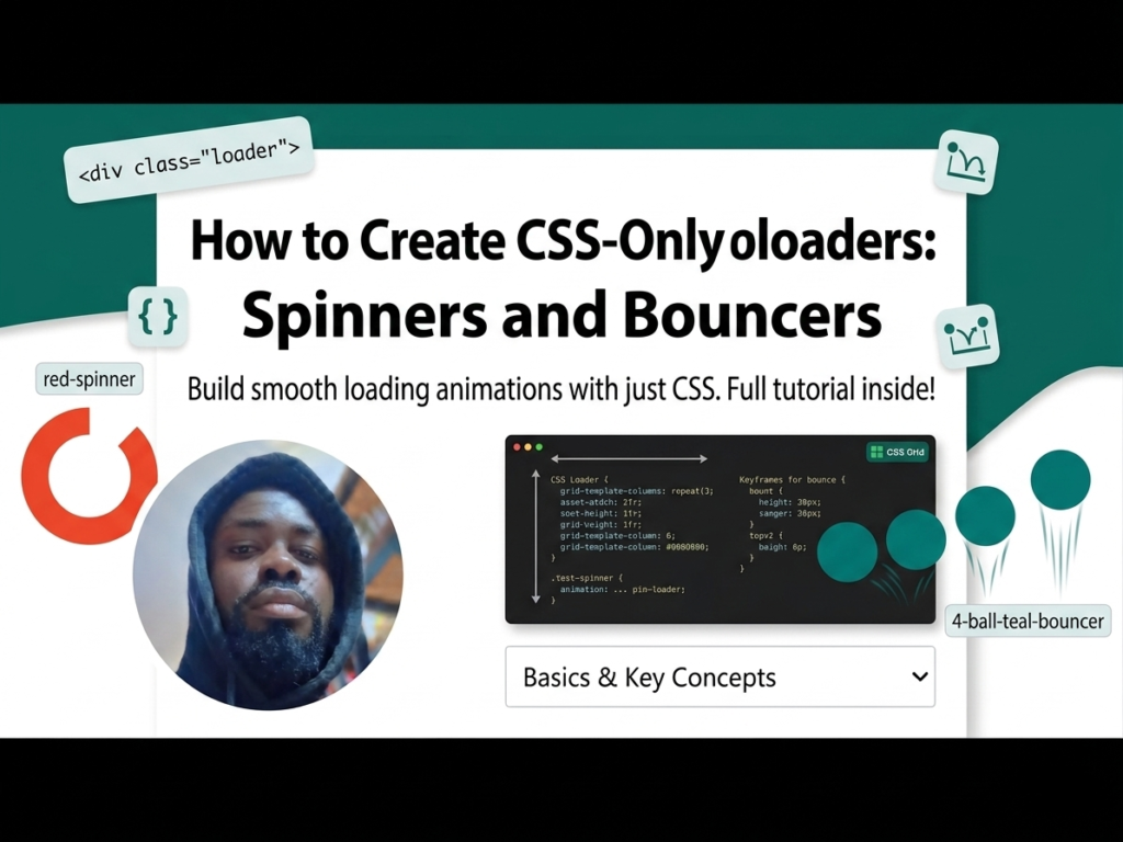
In modern web development, speed is key. However, when a page or an asset takes a moment to load, providing a visual cue is vital for keeping users engaged. Instead of using heavy GIFs or external libraries, you can build lightweight, high-performance preloaders using only HTML and CSS. This not only improves site speed but also gives you full control over colors and animations.
Lesson Overview
- What you will learn: How to create two distinct loading animations using CSS Keyframes.
- Key concepts: @keyframes, nth-child selectors, and cubic-bezier timing functions.
- Expected outcome: You will have a functional “Spinner” and a “Bouncing Ball” loader ready for any project.
We will create two different styles of loaders: a rotating spinner and a bouncing row.
Step 1: The HTML Structure
For the Spinner, we need a container with two nested divs. For the Bouncer, we use a container with four nested divs (one for each ball).
<div class=”spinner”>
<div></div>
<div></div>
</div>
<div class=”bouncer”>
<div></div>
<div></div>
<div></div>
<div></div>
</div>
Step 2: Designing the Spinner
The spinner uses border-radius: 50% to create a circle and border-top-color to show only one part of the ring. We then rotate it 360 degrees.
.spinner {
width: 100px;
height: 100px;
position: relative;
}
.spinner div {
box-sizing: border-box;
position: absolute;
width: 100%;
height: 100%;
border: 10px solid transparent;
border-top-color: red;
border-radius: 50%;
animation: spinnerOne 1.2s linear infinite;
}
/* Second half of the spinner */
.spinner div:nth-child(2) {
border: 10px solid transparent;
border-bottom-color: red;
animation: spinnerTwo 1.2s linear infinite;
}
Step 3: Creating the Animation Logic
Using @keyframes, we can control the rotation and even change the border-width mid-animation to create a “pulsing” effect.
@keyframes spinnerOne {
0% { transform: rotate(0deg); border-width: 10px; }
50% { transform: rotate(180deg); border-width: 1px; }
100% { transform: rotate(360deg); border-width: 10px; }
}
@keyframes spinnerTwo {
0% { transform: rotate(0deg); border-width: 1px; }
50% { transform: rotate(180deg); border-width: 10px; }
100% { transform: rotate(360deg); border-width: 1px; }
}
Step 4: The Bouncer Loader
This utilizes transform: translateY to move the balls up and down. By adding an animation-delay to each child, we create a wave-like sequence.
.bouncer div {
width: 20px;
height: 20px;
background: teal;
border-radius: 50%;
animation: bouncer 0.5s cubic-bezier(.19,.57,.3,.98) infinite alternate;
}
/* Staggered delays */
.bouncer div:nth-child(2) { animation-delay: 0.1s; }
.bouncer div:nth-child(3) { animation-delay: 0.2s; }
.bouncer div:nth-child(4) { animation-delay: 0.3s; }
@keyframes bouncer {
from { transform: translateY(0); }
to { transform: translateY(-100px); }
}
Playground
See the Pen CodePen Demo
Assignment
Task 1
Modify the Spinner code so that the two rotating lines are different colors (e.g., Blue and Orange) and increase the animation speed to 0.8s.
Task 2
Add a fifth ball to the Bouncer loader and adjust the animation-delay so the wave remains smooth.
Skill Check
- How do CSS Keyframes allow you to control the intermediate steps of an animation?
- What is the benefit of using cubic-bezier over simple keywords like linear or ease?
- How does the infinite property in an animation-shorthand affect user experience?
Advertisement