CSS units solved: how to choose between px, em, rem, vw, and vh
 remove_red_eye
19 Views
remove_red_eye
19 Views
Master CSS Units: px, em, rem, vw, and vh
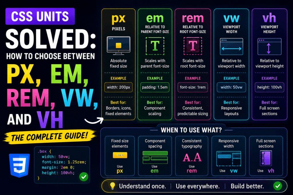
Choosing the wrong CSS unit can lead to broken layouts, accessibility issues, and nightmares during responsive design. As a web developer, mastering these units is your shortcut to building robust, accessible, and highly responsive user interfaces.
Here is how to choose the right unit for every scenario.
1. Absolute Units: Pixels (px)
Pixels are physical, absolute units. A pixel value remains exactly the same size regardless of the screen size, zoom level, or browser default configuration.
When to use px:
- Thin borders (e.g., 1px solid gray)
- Drop shadows and box shadows
- Specific layout constraints where elements must never scale
Why to avoid px for typography:
If a user changes their browser default font size for accessibility reasons, elements defined in px will ignore this preference. This creates a massive accessibility barrier.
/* Good use of px */
.card {
border: 1px solid #ccc;
box-shadow: 0 4px 8px rgba(0, 0, 0, 0.1);
}
2. Root-Relative Units: rem
The rem unit stands for “Root Em”. It is relative to the font-size of the root element (the html tag). By default, most modern browsers set the root font-size to 16px. Therefore, 1rem equals 16px.
When to use rem:
- Typography (font-size)
- Spacing (padding, margin, gap)
- Layout widths and heights
Why it is best practice:
Because rem is relative to the root, if a user changes their browser’s default font size to 20px, your entire design scales proportionally (1rem automatically becomes 20px).
html {
font-size: 16px; /* Browser default */
}
.text {
font-size: 1.25rem; /* Calculates to 20px (1.25 * 16) */
margin-bottom: 2rem; /* Calculates to 32px (2 * 16) */
}
3. Parent-Relative Units: em
The “em” unit is relative to the font-size of its direct parent element. If used on the “font-size” property itself, it is relative to the inherited font-size.
When to use em:
Properties that should scale relative to the element’s local typography, such as button padding, icon spacing, or line-height.
The Danger of em:
Using em on margins, padding, or nested structural elements can lead to compounding math problems, making sizes unpredictable.
.button {
font-size: 20px;
/* Padding scales dynamically if the font-size changes */
padding: 0.5em 1em; /* Top/bottom: 10px, Left/right: 20px */
}
—
4. Viewport Units: vw and vh
Viewport units are relative to the user’s browser window size. 1vw is equal to 1% of the viewport width, and 1vh is equal to 1% of the viewport height.
**When to use vw and vh:**
* Full-screen layouts or hero sections (using 100vh)
* Fluid typography that scales continuously with the screen width
* Split-screen layouts
.hero {
width: 100vw; /* Spans the full width of the viewport */
height: 100vh; /* Spans the full height of the viewport */
display: flex;
align-items: center;
justify-content: center;
}
Summary: The Developer’s Cheat Sheet
- rem: Use for typography, margins, padding, and layout wrappers to ensure global accessibility.
- em: Use for internal component spacing (like button padding) that must scale relative to the element’s text size.
- px: Use for fine details like borders, thin dividers, and static box shadows.
- vw/vh: Use for layout structures, hero heights, and responsive design breakpoints relative to screen size.