CSS grid vs flexbox solved: how to choose the right layout system
 remove_red_eye
8 Views
remove_red_eye
8 Views
Choosing the right layout system in CSS is a foundational milestone for any frontend developer. For years, web layout was a series of clever hacks involving floats, tables, and absolute positioning. Today, CSS Grid and CSS Flexbox offer native, robust solutions.
However, the abundance of choice often leads to decision paralysis. Developers frequently ask: “Should I build this with Grid or Flexbox?”
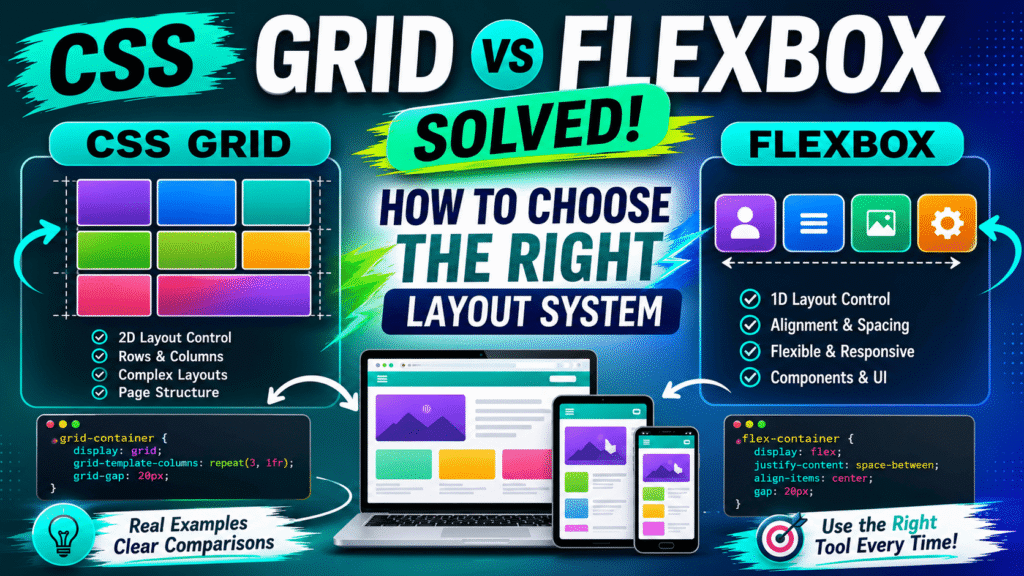
The short answer is: they are not rivals. They are complementary tools designed to solve different structural problems. Let us demystify how they work and establish a definitive framework for choosing the right system.
The Core Philosophies: Grid vs. Flexbox
To choose the right tool, you must understand the underlying philosophy of each layout engine.
Flexbox is fundamentally one dimensional. It handles layouts along a single axis at a time either horizontally (as a row) or vertically (as a column). Flexbox is content out. This means that the sizes of the elements inside the container dictate how the space is distributed.
Markup & Style
<div class=”flex-container”>
<div>Logo</div>
<div>Navigation</div>
<div>Profile</div>
</div>.flex-container {
display: flex;
justify-content: space-between;
align-items: center;
}CSS Grid is two dimensional. It handles both rows and columns simultaneously. Grid is layout in. This means you define the structural grid system first, and then place content into the predefined cells, regardless of the individual size of the content items.
Markup & Style
<div class=”grid-container”>
<div>Item 1</div>
<div>Item 2</div>
<div>Item 3</div>
<div>Item 4</div>
<div>Item 5</div>
<div>Item 6</div>
</div>.grid-container {
display: grid;
grid-template-columns: repeat(3, 1fr);
grid-template-rows: auto;
gap: 20px;
}When to Choose Flexbox
Flexbox shines when you are arranging a series of items in a single line and require flexibility in item sizing and spacing.
Common use cases for Flexbox include:
- Navigation bars and menus
- Form controls and inline buttons
- Media objects (image on the left, text on the right)
- Horizontal or vertical centering of a single element
The primary strength of Flexbox is its fluid adaptability. Properties like flex-grow, flex-shrink, and flex-basis allow elements to dynamically stretch, shrink, and fill space based on the viewport size.
<nav class=”navbar”>
<div class=”logo”>Brand</div>
<ul class=”nav-links”>
<li><a href=”#”>Home</a></li>
<li><a href=”#”>Services</a></li>
<li><a href=”#”>About</a></li>
<li><a href=”#”>Contact</a></li>
</ul>
</nav>.navbar {
display: flex;
justify-content: space-between;
align-items: center;
padding: 1rem 2rem;
background-color: #ffffff;
}
.nav-links {
display: flex;
gap: 1.5rem;
list-style: none;
}Flexbox Pitfalls and Best Practices
A common pitfall is using flex-wrap to build complex, multi-row gallery interfaces. While Flexbox can wrap items onto new lines, it cannot align elements across different rows. Each row acts as its own independent flex container, breaking vertical alignments. If you need item vertical alignment across wrapped rows, switch to CSS Grid.
Another best practice is to leverage the modern gap property for spacing. Avoid old habits of adding outer margins to flex items, which often require complex CSS selectors to clean up outer edges.
When to Choose CSS Grid
CSS Grid is the undisputed champion when you need absolute control over the entire layout area, establishing strict alignments in both directions.
Common use cases for CSS Grid include:
- Main page layouts (headers, sidebars, content areas, and footers)
- Complex, asymmetric dashboards
- Card galleries with strict row-and-column boundaries
- Image grids with overlapping elements
Grid allows you to define explicit tracks. It also introduces the fractional unit (fr), which distributes remaining free space proportionally.
<section class=”dashboard”> <article class=”widget”> <h3>Revenue</h3> <p>$12,500</p> </article>
<article class=”widget”>
<h3>Users</h3>
<p>1,245</p>
</article>
<article class=”widget”>
<h3>Orders</h3>
<p>328</p>
</article>
<article class=”widget”>
<h3>Performance</h3>
<p>98%</p>
</article>
</section>.dashboard {
display: grid;
grid-template-columns: repeat(auto-fit, minmax(280px, 1fr));
gap: 1.5rem;
padding: 2rem;
}CSS Grid Pitfalls and Best Practices
A major mistake in Grid development is over-defining grid structures. Many developers write explicit rows for content that should naturally be dynamic. Rely instead on auto-rows or the auto-fit keyword combined with minmax() to create fluid, responsive layouts without relying on endless media queries.
Avoid using named grid areas (grid-template-areas) for highly dynamic, variable-content items unless the overall page layout remains completely static across breakpoints.
Combining Grid and Flexbox
The true sign of a senior developer is knowing how to combine both technologies in a single project.
The rule of thumb is: use Grid for the macro-layout (the page skeleton), and use Flexbox for the micro-layout (the individual components inside the grid cells).
<div class=”page-layout”>
<aside class=”sidebar”>
Sidebar
</aside>
<main class=”content”>
<div class=”card-component”>
<h3>Card Title</h3>
<p>
This card uses Flexbox internally
while the page uses Grid externally.
</p>
<button>Read More</button>
</div>
</main>
</div>.page-layout {
display: grid;
grid-template-columns: 250px 1fr;
grid-template-rows: auto 1fr;
height: 100vh;
}
.card-component {
display: flex;
flex-direction: column;
justify-content: space-between;
padding: 1.5rem;
}In this hybrid structure, the page layout benefits from the rigid, multi-column system of Grid, while the inner cards benefit from the flexible, vertical alignment capabilities of Flexbox.
Performance and Browser Compatibility
From a performance standpoint, modern browser rendering engines are highly optimized for both layout modules. However, complex layouts with deeply nested Flexbox elements can sometimes cause recursive style calculations, leading to layout thrashing during scrolls or resizes. Grid computations are highly parallelized and performant for flat DOM structures.
Browser compatibility is virtually a non-issue today. Both Grid and Flexbox have over 98% global support. For legacy browser fallbacks, feature queries provide a clean, modern way to serve alternative styles.
<div class=”card-wrapper”>
<article class=”card”>
<h3>Card One</h3>
<p>Content goes here.</p>
</article>
<article class=”card”>
<h3>Card Two</h3>
<p>Content goes here.</p>
</article>
<article class=”card”>
<h3>Card Three</h3>
<p>Content goes here.</p>
</article>
</div>.card-wrapper {
display: block;
}
@supports (display: grid) {
.card-wrapper {
display: grid;
grid-template-columns: repeat(3, 1fr);
gap: 16px;
}
}Using feature queries ensures that older browsers gracefully degrade to simple block or inline-block fallbacks, while modern devices enjoy the full power of CSS Grid.
Decision Matrix
To make the final choice simple, ask yourself these three diagnostic questions:
1. Do I need to control columns AND rows simultaneously?
- Yes: Use CSS Grid.
- No: Use Flexbox.
2. Does the size of the content need to determine the layout structure?
- Yes: Use Flexbox.
- No: Use CSS Grid.
3. Do I need elements to overlap or span multiple rows/columns?
- Yes: Use CSS Grid.
- No: Use Flexbox.