How to use the CSS display property correctly
 remove_red_eye
18 Views
remove_red_eye
18 Views
Introduction to CSS Display
The display property is the most important CSS property for controlling layout. It determines how an element behaves in the document flow and how it interacts with surrounding elements. Mastering it is essential for building responsive, bug-free layouts.
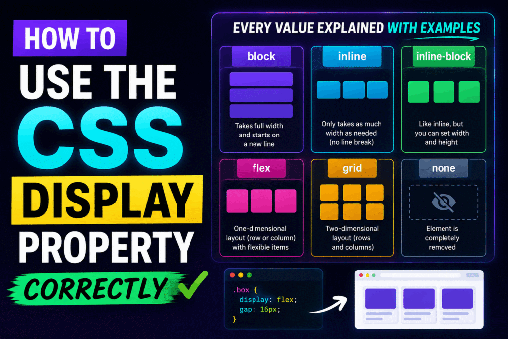
1. Block vs. Inline
Every HTML element has a default display value. The two most common are block and inline.
Block-level elements (like div, p, and h1) start on a new line and stretch to fill the full width of their parent container. They respect width, height, and all padding/margin properties.
.block-element {
display: block;
width: 100%;
margin: 20px 0;
}
Inline elements (like span, a, and strong) do not start on a new line. They only take up as much width as their content. They ignore top and bottom margin/padding, as well as height and width properties.
.inline-element {
display: inline;
padding: 0 10px; /* Top/bottom padding will not affect layout flow */
}
2. The Hybrid: Inline-Block
When you want an element to sit inline with text but still respect custom widths, heights, and vertical margins/padding, use inline-block. It is ideal for buttons, navigation links, and badge icons.
.button {
display: inline-block;
width: 150px;
height: 45px;
margin-top: 15px;
text-align: center;
}
3. Modern Layouts: Flexbox and Grid
For complex layout alignments, avoid using floats. Instead, turn to flex (one-dimensional layouts) and grid (two-dimensional layouts).
Use display: flex when you want to align items in a single row or column. It provides powerful alignment control along a primary axis.
.flex-container {
display: flex;
justify-content: space-between;
align-items: center;
}
Use display: grid when you need a rigid, multi-row, and multi-column structure.
.grid-container {
display: grid;
grid-template-columns: repeat(3, 1fr);
gap: 20px;
}
4. Hiding Elements: None vs. Hidden
To hide an element, you can use display: none. This completely removes the element from the document layout flow; it will take up zero space on the page.
.hidden-element {
display: none;
}
Note: If you want to hide an element but keep its physical space reserved on screen, use visibility: hidden instead.
Best Practices Checklist
- Use block for structural components that need to stack vertically.
- Use inline strictly for formatting text elements.
- Use inline-block when buttons or tags need custom dimensions while sitting side-by-side.
- Use flex for components, headers, or simple single-axis alignments.
- Use grid for overall page layout frameworks and complex dashboard designs.