
How to understand the CSS box model with real examples
 remove_red_eye
135 Views
remove_red_eye
135 Views
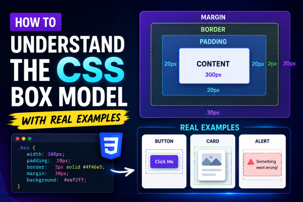
Every element on a web page is treated by browser rendering engines as a rectangular box. To design layouts successfully, you must master how these boxes are sized, spaced, and stacked. This concept is called the CSS Box Model.
Let’s break it down into simple, practical terms.
The Four Layers of the Box
Think of the CSS Box Model like a framed painting hung on a wall. It consists of four distinct layers, starting from the inside out:
1. Content: The actual image (text, image, or video).
2. Padding: The blank space around the painting inside the frame (clears space inside the border).
3. Border: The wooden frame itself (wraps around the content and padding).
4. Margin: The empty wall space around the frame, keeping other paintings at a distance (clears space outside the border).
Here is how these properties look in CSS:
.box {
width: 300px;
height: 200px;
padding: 20px;
border: 5px solid #333333;
margin: 30px;
}
How the Browser Calculates Box Size
By default, CSS calculates the total visible width of an element using this formula:
Total Width = Width + Left Padding + Right Padding + Left Border + Right Border
Using our code above, let’s calculate the total horizontal space the box occupies on the screen:
Content Width: 300px
Padding: 40px (20px left + 20px right)
Border: 10px (5px left + 5px right)
Total Visible Width: 350px
The margin (30px on each side) adds another 60px of invisible spacing on the page, but does not affect the visual size of the box itself.
This default behavior is called content-box. It can make responsive design difficult because adding padding makes your element wider than its defined width.
The Solution: Box-Sizing Border-Box
To make layouts predictable, professional developers alter how the browser calculates box dimensions. By using the box-sizing property with the value border-box, you tell the browser to absorb the padding and border into the specified width.
If you set a box to 300px wide with border-box, the total visible width remains exactly 300px. The browser automatically shrinks the content area to make room for your padding and borders.
Here is the universal CSS reset used in almost every modern project:
*, *::before, *::after {
box-sizing: border-box;
}
With this reset applied, let us look at a real-world example.
Real-World Example: A Profile Card
Let us build a clean, styled profile card component using our newly gained understanding of the box model.
Here is the HTML structure:
<div class="profile-card">
<h2>Desire Lubega</h2>
Software Engineer from Uganda.
</div>
And here is the corresponding CSS:
.profile-card {
/* Box sizing standard */
box-sizing: border-box;
/* Dimensions */
width: 320px;
/* Inner spacing (Padding) */
padding: 24px;
/* The outer frame (Border) */
border: 1px solid #e0e0e0;
border-radius: 8px;
/* Background & Typography */
background-color: #ffffff;
color: #333333;
font-family: sans-serif;
/* Outer spacing to center on screen (Margin) */
margin: 40px auto;
/* Shadow for depth */
box-shadow: 0 4px 6px rgba(0, 0, 0, 0.05);
}
.profile-card h2 {
/* Push the paragraph down (Margin) */
margin: 0 0 8px 0;
font-size: 1.5rem;
}
.profile-card p {
/* Clear default browser margins */
margin: 0;
color: #666666;
line-height: 1.5;
}
Playground
See the Pen CodePen Demo
Summary of Best Practices
- Use Padding when you want to change the visual size of an element or create breathing room inside a border.
- Use Margin to create space between different elements on your page. Margins can also be set to auto to center block-level elements horizontally.
- Always apply box-sizing: border-box globally to ensure your layout widths behave predictably.
Advertisement
Recent Posts
- Mastering Time: A Practical Guide to Building a Digital Clock with JavaScript
- How to Easily Add Live Crypto Prices to Your Website
- CSS grid vs flexbox solved: how to choose the right layout system
- How to create sticky headers and footers that work on all screens
- How to build responsive layouts using flexbox step by step