How To Create Skeleton Loading Animation With CSS
 remove_red_eye
48 Views
remove_red_eye
48 Views
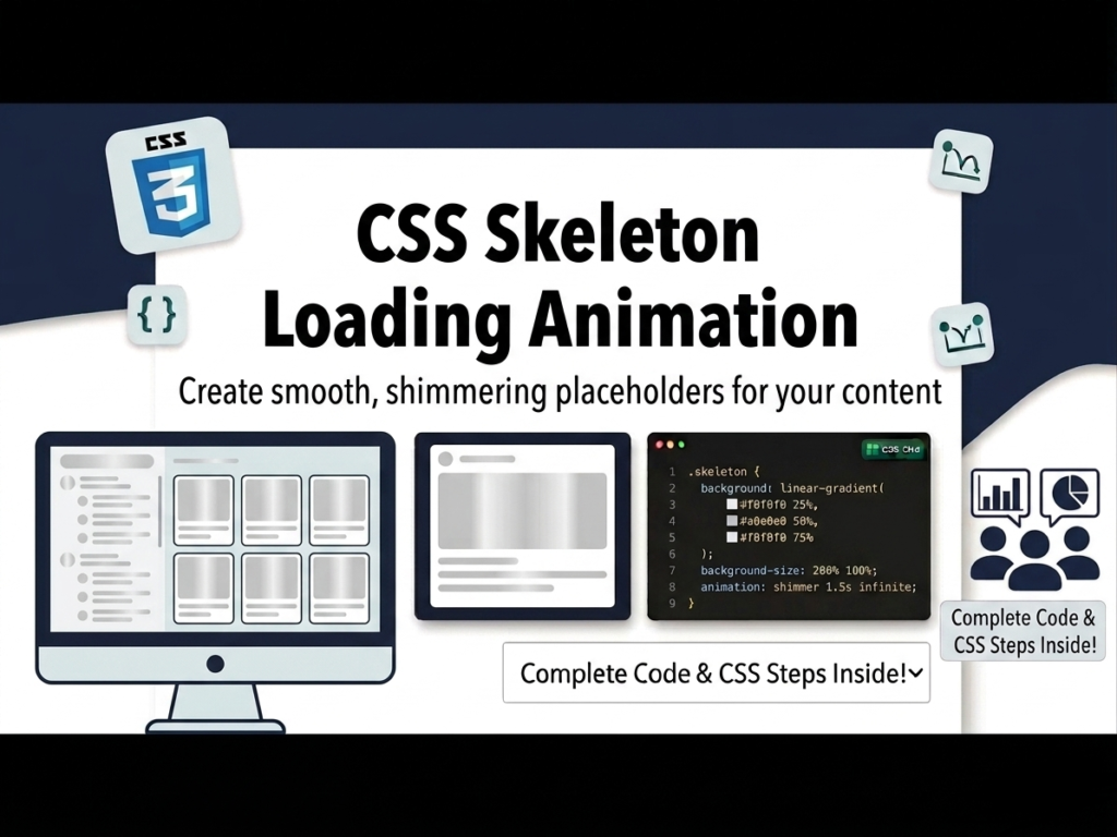
User experience (UX) is significantly improved when users see a “preview” of content while it is being fetched from an API. Traditional loading spinners are being replaced by Skeleton Screens gray placeholders that mimic the actual layout of the page. In this guide, we will build a responsive user grid that shows a pulsing skeleton animation until the data is fully loaded from a real API.
Lesson Overview
- What you will learn: How to create a pulsing animation using CSS @keyframes and use the HTML <template> tag.
- Key concepts: HSL color values, cloning DOM nodes, and the fetch() API.
- Expected outcome: A professional-looking user grid that transitions from a loading state to a live data state.
We will create a reusable card component that starts as a gray skeleton and fills with user data once the API call is successful.
Step 1: Using the HTML <template> Tag
The <template> tag is perfect for this. The browser ignores the content inside it until you tell JavaScript to clone it. This keeps your loading logic separate from your UI.
<div class=”grid”></div>
<template id=”card-template”>
<div class=”card”>
<div class=”header”>
<div class=”header-img skeleton”></div>
<div class=”title” data-title>
<div class=”skeleton skeleton-text”></div>
<div class=”skeleton skeleton-text”></div>
</div>
</div>
<div data-body>
<div class=”skeleton skeleton-text”></div>
<div class=”skeleton skeleton-text”></div>
<div class=”skeleton skeleton-text”></div>
</div>
</div>
</template>
Step 2: Creating the Pulse Animation
The “Skeleton” effect is created by alternating the background color between two shades of gray. We use hsl (Hue, Saturation, Lightness) because it is much easier to adjust brightness than using HEX codes.
.skeleton {
opacity: 0.9;
animation: skeleton-loading 1s infinite alternate;
}
.skeleton-text {
width: 100%;
height: 0.5rem;
margin-bottom: 0.5rem;
border-radius: 4px;
}
@keyframes skeleton-loading {
0% {
background-color: hsl(200, 20%, 70%); /* Darker Gray */
}
100% {
background-color: hsl(200, 20%, 95%); /* Lighter Gray */
}
}
.grid {
display: grid;
grid-template-columns: repeat(auto-fit, minmax(200px, 1fr));
gap: 20px;
padding: 20px;
}
Step 3: Controlling the Logic with JavaScript
First, we fill the grid with 10 empty “skeleton” cards. Then, we fetch data from a JSON placeholder API. Once the data arrives, we clear the skeletons and inject the real user names and emails.
const cardTemplate = document.querySelector(‘#card-template’);
const grid = document.querySelector(‘.grid’);
// 1. Show 10 skeletons immediately on page load
for(let i = 0; i < 10; i++){
grid.append(cardTemplate.content.cloneNode(true));
}
// 2. Fetch the actual data
fetch(“https://jsonplaceholder.typicode.com/users”)
.then(res => res.json())
.then(users => {
grid.innerHTML = “”; // Clear the skeletons
users.forEach(user => {
const card = cardTemplate.content.cloneNode(true);
// Fill the card with real data
card.querySelector(‘[data-title]’).textContent = user.name;
card.querySelector(‘[data-body]’).textContent = user.email;
grid.append(card);
});
});
Playground
See the Pen CodePen Demo
Assignment
Task 1
Modify the CSS @keyframes to use a different color hue (for example, a light blue hsl(210, 20%, 80%)) to match a specific brand color.
Task 2
Change the number of skeletons that appear on page load from 10 to 6, and adjust the grid CSS so that it shows exactly 3 cards per row on desktop screens.
Skill Check
- Why is the HTML5 <template> tag useful for repeating UI elements?
- How does the alternate property in a CSS animation change the movement of the loading pulse?
- What are the benefits of using HSL over RGB or HEX when designing UI themes?
Advertisement