Using CSS Clip-Path & Shape-Outside for Unique Designs
 remove_red_eye
84 Views
remove_red_eye
84 Views
Modern CSS gives designers powerful tools to create visually interesting layouts without relying on complex graphics or JavaScript. Two of the most exciting features are clip-path and shape-outside. When combined, they allow images to take on custom shapes while text flows naturally around them, creating magazine-style layouts directly in CSS.
In this article, we’ll explore how these properties work using a simple example that displays an image clipped into a circular shape with text wrapping around it.
What is clip-path?
The clip-path property allows you to define a visible region of an element. Anything outside that region becomes invisible. This makes it possible to create circles, polygons, ellipses, and other shapes without editing the image itself.
Example:
clip-path: circle(35% at 50% 50%);
This means:
- circle → the clipping shape
- 35% → the radius
- 50% 50% → the center of the circle (horizontal and vertical)
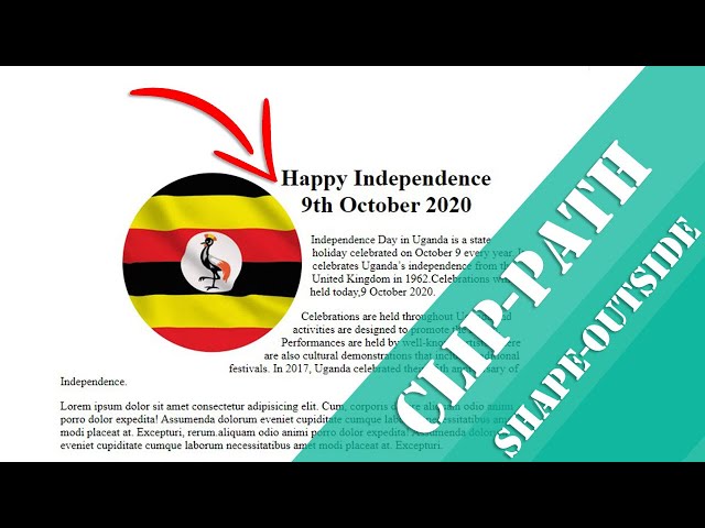
- In our example, the image is clipped into a circular shape, giving it a soft, modern design.
What is shape-outside?
While clip-path controls how the element looks, shape-outside controls how text flows around it.
Normally, when you float an image, text wraps around the rectangular bounding box. But with shape-outside, the text wraps around the actual shape.
Example:
shape-outside: circle();
Now the text follows the circular outline instead of a square.
HTML Structure
Below is the HTML structure used for the layout.
<div class=”container”>
<div class=”info”>
<img src=”uganda.jpg” alt=”uganda”>
<div class=”content”>
<h1>Happy Independence 9th October 2020</h1>
<p>Independence Day in Uganda is a state holiday celebrated on October 9 every year. It celebrates Uganda’s
independence from the United Kingdom in 1962.Celebrations will be held today,9 October 2020.</p>
<p>Celebrations are held throughout Uganda and activities are designed to promote the nation. Performances are
held by well-known artists. There are also cultural demonstrations that include traditional festivals. In
2017, Uganda celebrated their 55th anniversary of Independence.</p>
<p>Lorem ipsum dolor sit amet consectetur adipisicing elit. Cum, corporis dolore aliquam odio animi porro dolor
expedita! Assumenda dolorum eveniet cupiditate cumque laborum necessitatibus amet modi placeat at. Excepturi,
rerum.aliquam odio animi porro dolor
expedita! Assumenda dolorum eveniet cupiditate cumque laborum necessitatibus amet modi placeat at. Excepturi.
</p>
</div>
</div>
</div>
The structure is simple:
- container keeps everything centered.
- info contains the image and text.
- content holds the article content.
CSS Styling
The key styling happens in the .info img selector.
.info img{
float:left;
margin-right:.1rem;
margin-bottom:.2rem;
clip-path: circle(35% at 50% 50%);
shape-outside: circle();
}
Here’s what each part does:
1. float: left
This allows text to wrap around the image.
2. Margins
Creates spacing between the image and text.
3. clip-path
Clips the image into a circular shape.
4. shape-outside
Tells the browser to wrap text around the circular boundary instead of a rectangle.
The result is a clean editorial-style layout similar to what you might see in magazines or modern blogs.
Centering the Page Layout
The body is styled with Flexbox to center the content vertically and horizontally.
body{
display: flex;
flex-direction: column;
align-items: center;
justify-content: center;
height: 100vh;
}
This ensures the design stays centered on larger screens.
Responsive Design
For smaller screens, the circular layout may not work well. That’s why a media query removes the float and clipping.
@media screen and (max-width: 684px){
.info img{
float:none;
clip-path: none;
}
}
This allows the image to behave normally on mobile devices, improving readability and layout flow.
Why Use clip-path and shape-outside?
These properties help you:
- Create unique layouts without extra images
- Improve visual storytelling
- Build magazine-style blog designs
- Reduce reliance on graphics software
They are especially useful for hero sections, blog posts, and editorial content layouts.
Final Thoughts
CSS continues to evolve, giving developers more creative control directly in the browser. By combining clip-path and shape-outside, you can transform simple layouts into visually engaging designs with minimal code.
Try experimenting with other shapes such as:
- ellipse()
- polygon()
- inset()
These can unlock even more creative possibilities for your web designs.
Github Repo: Source code
Happy coding!
Advertisement