How to Create a Cutout Text Effect Using CSS
 remove_red_eye
57 Views
remove_red_eye
57 Views
Creating visually stunning text effects can greatly enhance the look and feel of your website. One such effect is the “cutout text effect,” where text appears to be “cut out” from an image or background, allowing the background to shine through. This effect can give your page a dynamic and engaging look. In this blog post, we’ll guide you through the steps to create a cutout text effect using HTML and CSS.
What We’ll Create
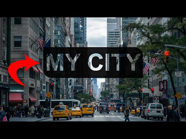
We’ll create a simple page where the text is cut out and the background image shows through the letters. Our background will be a beautiful cityscape, but this technique can be applied to any type of image or background.
Tutorial
Step 1: Set Up Your HTML Structure
The HTML structure is simple. You only need a <h1> tag to hold the text. Let’s start by setting up the basic HTML:
<html lang=”en”>
<head>
<meta charset=”UTF-8″>
<meta name=”viewport” content=”width=device-width, initial-scale=1.0″>
<title>Cutout Effect</title>
<link rel=”stylesheet” href=”style.css”>
</head>
<body>
<h1 class=”city”>my city</h1>
</body>
</html>
In this code, we have a <h1> element with the class city. This is the text that will be affected by the cutout effect. We’ll style it using CSS to achieve the cutout effect.
Step 2: Style the Page with CSS
Now let’s move on to styling the page. We’ll start by defining the background and the overall layout, followed by styling the cutout text.
Here’s the CSS code:
body{
display: flex;
flex-direction: column;
align-items: center;
justify-content: center;
background-image:url(‘city3.jpg’);
background-repeat: no-repeat;
background-size: cover;
background-position: center center;
}
.city{
background-color:rgba(0,0,0,.9);
border-radius:0 50px 0 50px;
color:#fff;
font-size:140px;
font-family: Arial, Helvetica, sans-serif;
padding:10px;
text-transform: uppercase;
mix-blend-mode: multiply;
}
Let’s break down the important parts:
Body Styling:
- display: flex;: Using flexbox allows us to center the content both vertically and horizontally.
- background-image: url(‘city3.jpg’);: This line sets a background image of a city. Make sure the image is placed in your project directory.
- background-size: cover;: This ensures the background image covers the entire screen area.
- background-position: center center;: This centers the background image within the viewport.
Text Styling:
- color: #fff;: This makes the text white, so it stands out.
- font-size: 140px;: Sets a large font size for the text.
- font-family: Arial, Helvetica, sans-serif;: The font used is sans-serif, which looks clean and modern.
- text-transform: uppercase;: Converts the text to uppercase for a bolder, more impactful look.
- background-color: rgba(0, 0, 0, .9);: Adds a semi-transparent black background to the text, which makes it appear more like a cutout, letting the background peek through.
- border-radius: 0 50px 0 50px;: Adds rounded corners to the text box for a softer look.
- mix-blend-mode: multiply;: This is a crucial property that blends the text with the background, creating the cutout effect.
Step 3: The Cutout Effect Explained
- The key to the cutout text effect is the combination of background-color, mix-blend-mode, and the background-image. Here’s how it works:
- The background-color on the .city class is set to a semi-transparent black (rgba(0,0,0,.9)). This darkens the text area slightly while still allowing the background image to show through.
- The mix-blend-mode: multiply; property helps create the cutout effect. The text will interact with the background image using the “multiply” blend mode, which allows the underlying image to be visible through the text while blending with the colors.
- Since the text is white (color: #fff;), and the background has a dark transparent layer, the result is that the text “pops” against the backdrop, while still allowing the cityscape image to be visible within the letters.
Step 4: Testing the Effect
Once you’ve set up the HTML and CSS, simply load your page in a browser. If everything is done correctly, you should see the text “my city” with the cutout effect applied. The background image will be visible through the text, giving the illusion that the text is cut out from the page.
Github Repo: Source code
Final Thoughts
With just a few lines of HTML and CSS, you can create this beautiful cutout text effect. The technique is flexible and can be customized with different fonts, colors, and background images. This effect works well for headers, banners, or any other part of your website where you want to create an impactful visual experience.
Experiment with different images, fonts, and blend modes to achieve your desired effect. Whether you’re building a city-themed website like the example above or experimenting with other design styles, this CSS cutout text effect can add a modern touch to your web design.
Happy coding!
Advertisement