How To Create A Stacked Gallery Using HTML And CSS
Creating visually engaging galleries on websites can be a fun and creative way to showcase images. One such effect is the stacked gallery layout, where images overlap each other in a cascading fashion. In this blog post, we’ll walk through how to create a stacked image gallery using HTML and CSS. By the end, you’ll have a sleek, interactive gallery that adds a dynamic touch to any web page.
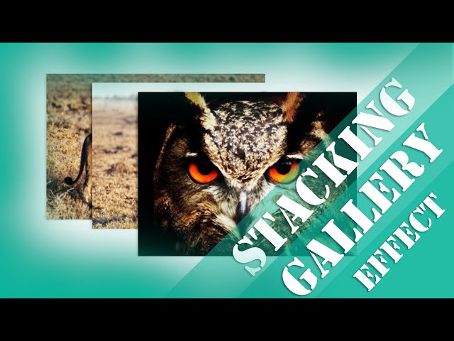
What is a Stacked Gallery?
A stacked gallery involves placing multiple images on top of one another, creating a stacked or overlapping effect. With CSS, we can manipulate image positions and make them interactive by adding hover effects and animations. This makes the gallery look modern and interactive, engaging the viewer in a fun way.
Tutorial
Step 1: Basic HTML Structure
Let’s start by creating the HTML structure for our gallery. It’s very simple: we’ll have a container (with the class .gallery-section) to hold our images. Each image will be placed inside this container.
<html lang=”en”>
<head>
<meta charset=”UTF-8″>
<meta name=”viewport” content=”width=device-width, initial-scale=1.0″>
<title>Css Gallery</title>
<link rel=”stylesheet” href=”style.css”>
</head>
<body>
<div class=”gallery-section”>
<img src=”lion.jpg” alt=”lion” class=”img1″>
<img src=”zebra.jpg” alt=”zebra” class=”img2″>
<img src=”owl.jpg” alt=”owl” class=”img3″>
</div>
</body>
</html>
Step 2: Styling with CSS
Next, let’s add the CSS to style our gallery and give it the stacked effect. The key elements to achieve this are positioning, z-index, and transformations.
Here’s the breakdown of the CSS used in this gallery:
1.Body Styling:
We begin by limiting the width of the page and centering the content with margin: 0 auto. We also make sure to keep the content vertically aligned.
body {
max-width: 70%;
margin: 0 auto;
display: flex;
flex-direction: column;
justify-content: center;
height: 50vh;
}
2.Gallery Section:
The .gallery-section div is positioned relatively to allow us to position the images absolutely within it.
.gallery-section {
position: relative;
}
3.Image Styling:
Each image is given a width of 40% and an absolute position to stack them on top of each other. To create the effect of depth and interactivity, the z-index property is used, ensuring that the images overlap correctly.
.gallery-section img {
width: 40%;
position: absolute;
z-index: 10;
transition: all .5s;
box-shadow: -3px 1px 5px rgba(0, 0, 0, .5);
}
4.Positioning Each Image:
We use specific values for left and top to arrange the images in a stacked fashion.
.img1 {
left: 5rem;
}
.img2 {
left: 10rem;
top: 1rem;
}
.img3 {
left: 15rem;
top: 2rem;
}
These values will create a slight shift in position for each image, making them appear stacked and staggered, one above the other.
5.Hover Effect:
We add a hover effect for when users interact with the images. The hovered image will zoom in, rotate slightly, and appear above the other images with a higher z-index. Additionally, the non-hovered images will scale down and fade out slightly.
.gallery-section img:hover {
z-index: 20;
transform: scale(1.2) rotate(-10deg);
}
.gallery-section:hover img:not(:hover) {
transform: scale(.9);
opacity: 0;
}
Step 3: Making it Responsive
Finally, we want our gallery to look good on smaller devices as well. For mobile users, we reduce the left positioning values for the images to fit the screen better.
@media screen and (max-width: 500px) {
.img1 {
left: 5rem;
}
.img2 {
left: 7rem;
}
.img3 {
left: 10rem;
}
}
This ensures that the gallery doesn’t break on smaller screens, and the images still maintain their stacked appearance while being more compact.
Full Code Example:
HTML:
<html lang=”en”>
<head>
<meta charset=”UTF-8″>
<meta name=”viewport” content=”width=device-width, initial-scale=1.0″>
<title>CSS Gallery</title>
<link rel=”stylesheet” href=”style.css”>
</head>
<body>
<div class=”gallery-section”>
<img src=”lion.jpg” alt=”lion” class=”img1″>
<img src=”zebra.jpg” alt=”zebra” class=”img2″>
<img src=”owl.jpg” alt=”owl” class=”img3″>
</div>
</body>
</html>
CSS:
body{
max-width: 70%;
margin:0 auto;
display: flex;
flex-direction: column;
justify-content: center;
height: 50vh;
}
.gallery-section{
position: relative;
}
.gallery-section img{
width:40%;
position: absolute;
z-index:10;
transition:all .5s;
box-shadow: -3px 1px 5px rgba(0,0,0,.5);
}
.img1{
left:5rem;
}
.img2{
left:10rem;
top:1rem;
}
.img3{
left:15rem;
top:2rem;
}
.gallery-section img:hover{
z-index:20;
transform: scale(1.2) rotate(-10deg);
}
.gallery-section:hover img:not(:hover){
transform:scale(.9);
opacity:0;
}
@media screen and (max-width:500px){
.img1{
left:5rem;
}
.img2{
left:7rem;
}
.img3{
left:10rem;
}
}
Conclusion
With just a few lines of code, you can create an engaging and interactive stacked gallery using HTML and CSS. The combination of absolute positioning, z-index, and hover effects gives the gallery a modern look that responds to user interaction. This is a great way to add some flair to your website and make it more visually dynamic.
Feel free to experiment with the design, adjust the spacing, or add more images to suit your needs. Happy coding!
account_box Author: KTim
date_range Date: 11th, March 2026
access_time Time: 10:24 am
remove_red_eye Views: 21 Views